Tesla OS 7 has serious usability problems combined with a hit from the ugly stick
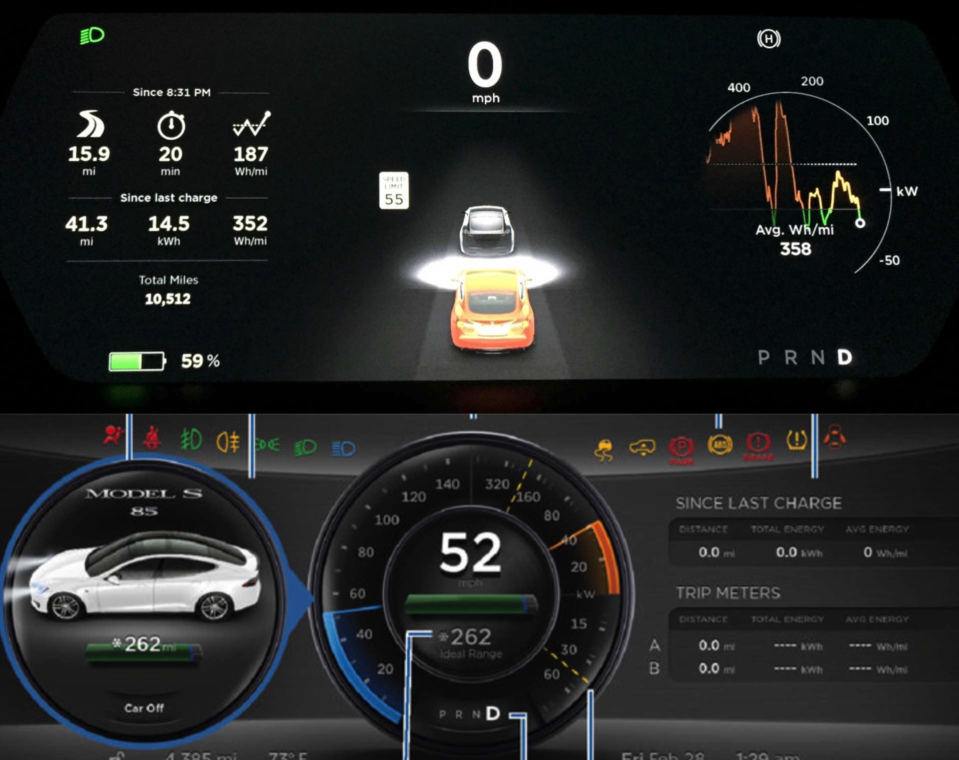
October 15th, 2015: Tesla released their OS version 7 – featuring Autopilot. A self driving car, who wouldn’t want to update? Well, I wish I hadn’t and I want to downgrade. The instrument panel is now very difficult to get the information I care the most about. Here is a screen shot of the car stopped at a light behind another car:
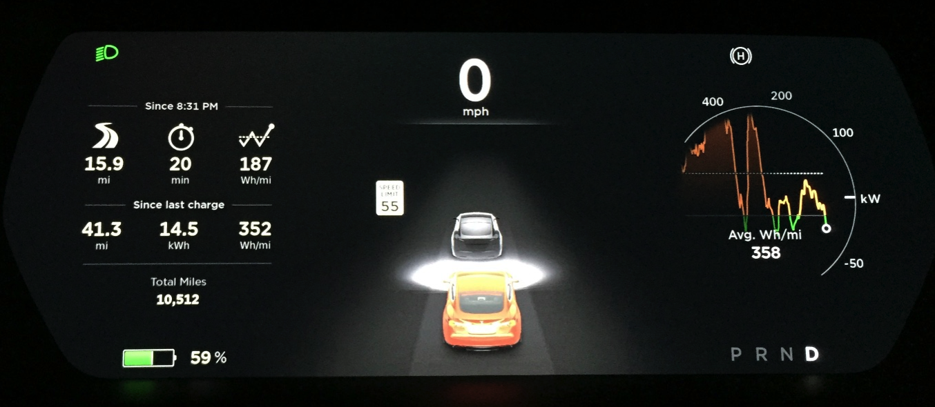
I get it. Tesla is trying to make the car the center of the universe and show you your surroundings. The side lane indicators turn from the a light gray to a white to indicate when you can turn on auto-steering based on how much information the car can read from its sensors. It turns blue once it is set to following the lane. It flashes halos around your car when other cars or objects are nearby. Your current speed is a digital number up on top. This is all interesting, but I don’t care about this in my normal driving, and only care about this when autopilot is on. I do want to see the detailed sensor data, but not in the way that takes over the entire panel.
What is important for driving? Speed, power and battery level. All previously shown on this beautifully designed gauge:
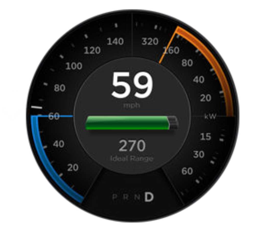
Speed. Speed is the most important factor when driving, and it is right in the middle of the screen. However, even more important are the analog gauges indicating your speed and power. At a quick glance you can instantly see your speed by looking at the blue line on the left. You can quickly see if you are speeding; the blue line turns to a white line once you past the known speed limit. The known speed limit is a beautifully thought out small white line. Now, with the new user interface you are forced to read the digital speed number, and mentally interpret it. You then have read the digital speed limit sign, and think if you are higher or lower than this number to know if you are speeding. The old interface was even step better; it would flip the battery meter over and show you the speed limit at you once you pass through it. This subtle animation draws your eyes attention to it subtly alerting you to the fact that you are speeding.
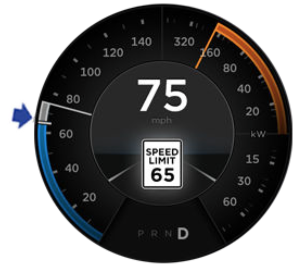
Why are these analog gauges so much better? People have known this for years. Glass cockpits in airliners still have analog gauges. The book “Automotive Electrical Handbook” highlights some other reasons: you get an overall idea of the scale of the value, and “you can read the gauge without actually looking at the numbers”. You also don’t really care about the exact value; it isn’t important information. I want an analog gauge.
Power. The power meter was on the right hand side of the gauge; a beautiful orange when you are consuming power, and a green when you are in regen. When hypermiling and maximizing distance on long drives, I would frequently try to keep the kW draw as low as possible. Now we have this much smaller power gauge tucked to the left or right side of your digital dashboard:
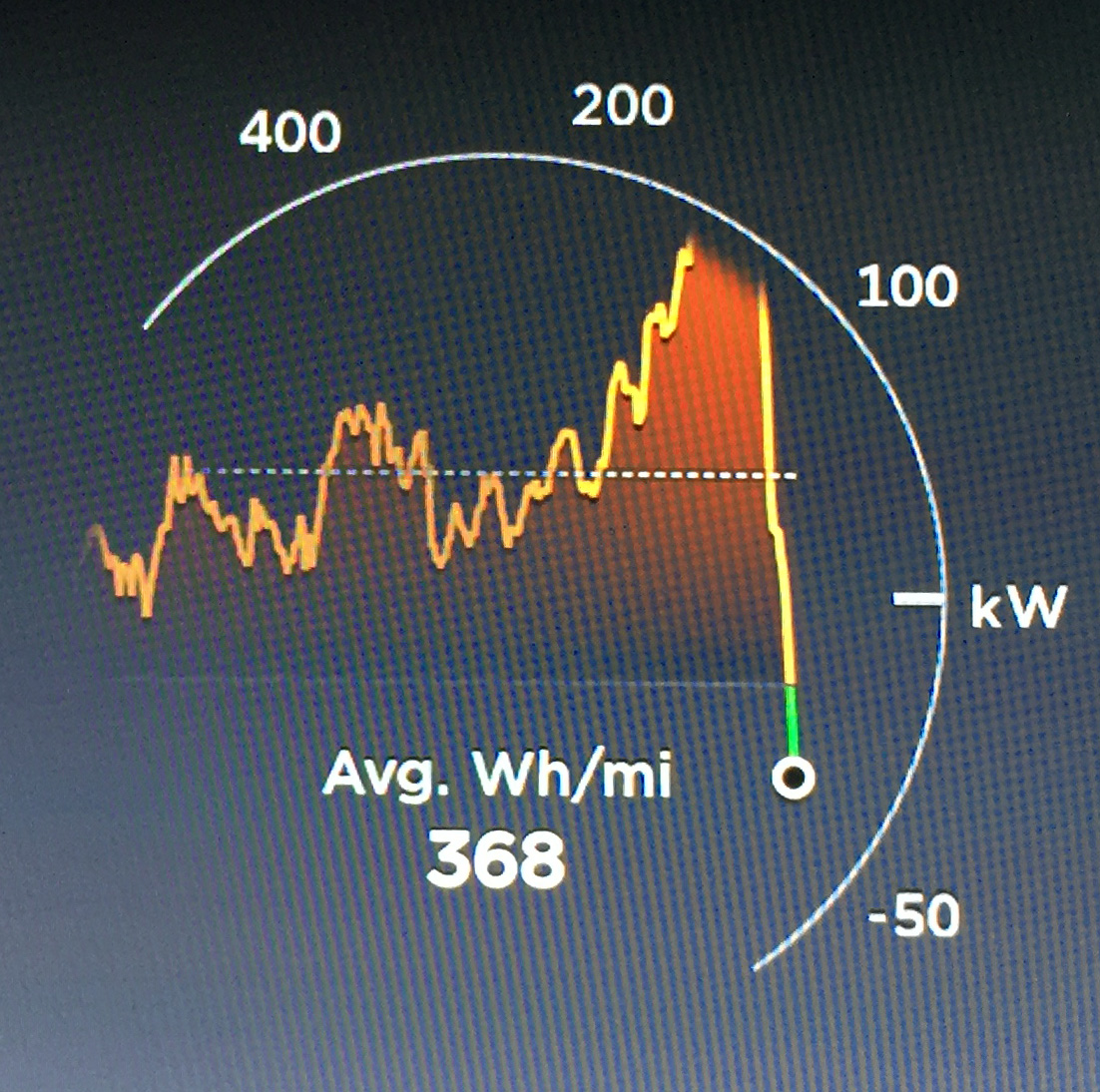
It is a lot harder to see your power meter when looking at a glance. The gauge has become too busy. I have no idea what scale the graph is showing me. But worse, the power meter no longer has the fine grained steps it previously had: 20, 40, 80, 160, etc —now it only has 100, 200, 400. Before it also wasn’t linear, which allowed you to see more details about your power consumption at low levels. This was very important when I was trying to maximize range. The new gauge is much more difficult to read, and I’m not looking forward to my next long distance trip. And where are the yellow dashed limiters that we used to see on cold days?
Battery. We still live in an age where your battery level is very important to know. Previously, it was shown in the center of the universe and had a very large size. This means you can more easily tell how much of it is consumed just by looking at it at a glance. There were literally more pixels to show the range, and therefore you had a more fine grained idea of what value it was at. Here are the two dash boards side by side to emphasize my point:
The 17” panel. The main problem here are the climate controls. It is really hard to tell between the enabled and disabled state.
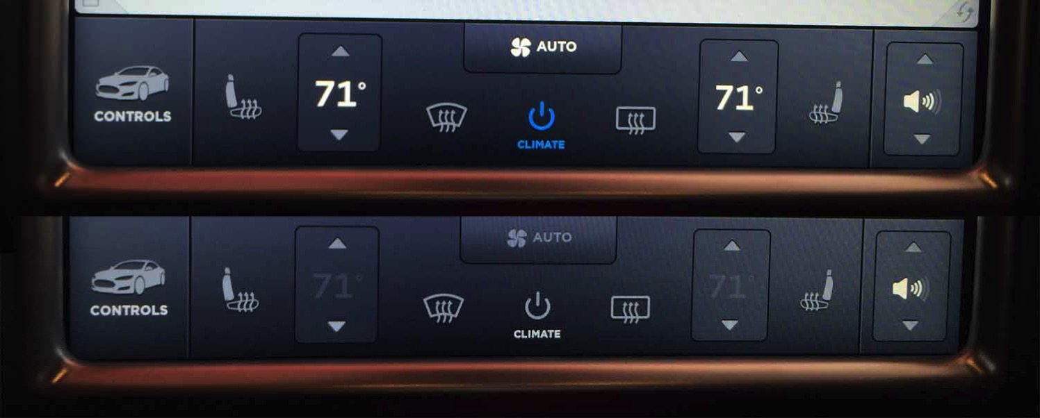
The CONTROLS button is enabled, but it is exactly the same gray as the disabled windshield heater buttons. The climate button’s enabled state is blue, which differs for no apparent reason. The temperature disabled button is yet a different gray. Now I have to take more time to think about what button I need to click on because I can’t quickly tell the state. The old UI was just obvious because it was skeuomorphic.
The rest of the panel doesn’t matter to me; it isn’t information that is very important to driving.
Other problems. The headlight and high beam light indicator is now in the top left of the instrument panel. For me, this is now hidden behind the circular steering wheel! I can’t see it — and I’m going to have to move my wheel up to an uncomfortable height to have it appear in my vision. The turn signal lights aren’t obvious. Previously they would blink completely on and off, and it was really clear when they were on and what side was blinking. Now, the white arrow inside the green signal indicator blinks — it is too subtle. I preferred the much more obvious blinking of the entire green signal indicator, and it was more obvious to me when it was blinking. I bet people who are hard of hearing will frequently leave the blinkers blinking too long.
Heating and cooling. Something changed here. The air blows out colder than I want it to, and hitting the temp up a notch or two doesn’t seem to make it respond like it used to.
The ugly stick. The new UI is ugly. Everyone I know that has a Model S has said this. Previously we had a beautiful skeuomorphic design with subtle gradients and color transitions. Now we have a bold white that sticks out and makes my eyes want to bleed. It is just for my eyes to look at the UI because those whites stick out so much. The main 17” display also looks like they accidentally desaturated everything.
Praise. Let me give Tesla some praise. The new trip meter is awesome. I really like knowing how long my current drive has taken, and the energy I’ve used.
What Tesla can do. First, bring back the functionality that is missing. Add an option to show the main circular gauge. Add a new side gauge to show the cool new sensor information. I’d imagine it would be something like this hacked Photoshop mockup:
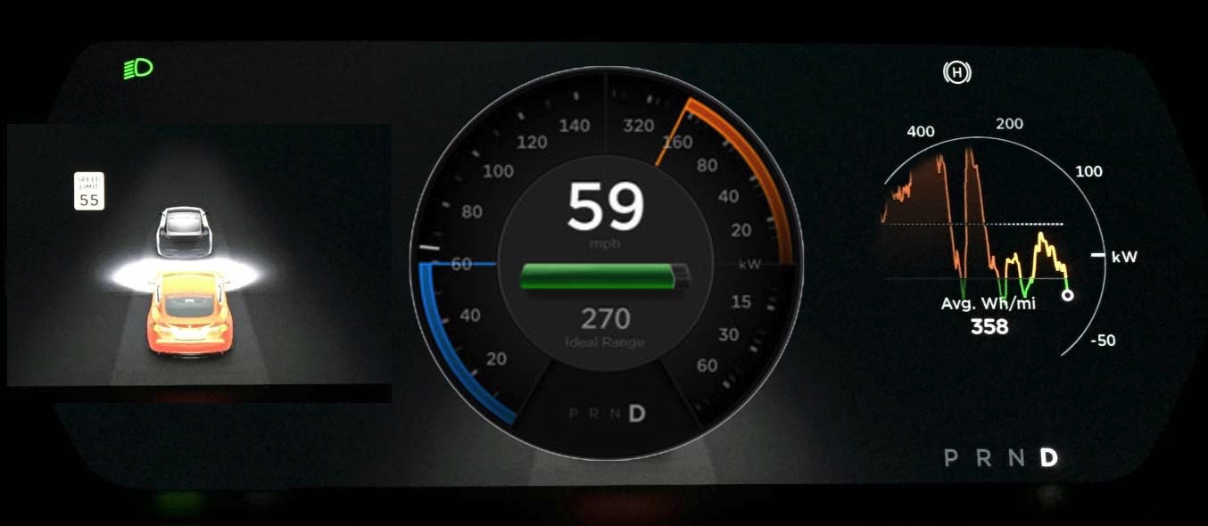
I can easily picture how engaging adaptive cruise control (and subsequently auto steering) would do a cool animation to swap the speedometer out and show you the current user interface. At that point it is fine; the information isn’t necessary because I am not controlling the car.
I would also like to see some more depth added to the controls, and reduce the brightness of a lot of the non essential whites. This was previously done; the range number is less important than the digital speed number, and therefore it was less bright. Right now, everything seems to have an equal amount of white and brightness, which makes it harder for your eyes to quickly hone in on the most essential parts.
Notes: All images were taken by me, or screen shots from the Tesla manual. Please contact corbin at corbinstreehouse for permission to use my pictures and any part of this article. Permission will be granted if you link back to my website.


[…] Corbin Dunn: […]