HDR vs non HDR
HDR images can really pull out some highlights that you normally wouldn’t see.
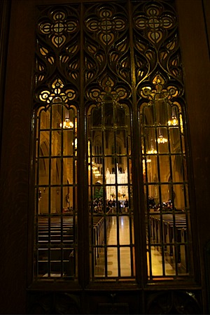
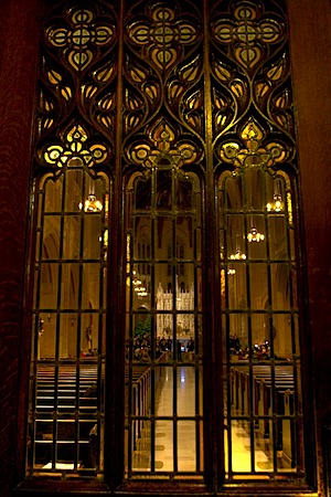
Here’s a comparison of an HDR generated by taking a single RAW photo and exporting 3 different exposures from Aperture. I then combined them in Photomatrix.
Original:
Generated HDR, including some cropping and alignment:
Photo also on flickr.
To me, the HDR looks more real, and feels like what I was seeing at that time. The picture is Louise’s choir group, the Choral Project at a really cool St Dominics Church in San Francisco that had huge ceilings and amazing flying butresses that were apparently added after the fact to retrofit for earthquakes.


