New blog layout
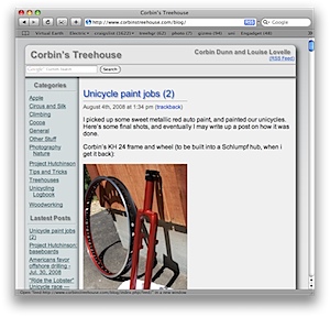
I updated my blog layout. I realize it doesn’t work that well in IE. In versions less than 7, it doesn’t support transparent png images, so the backgrounds probably look bad. In IE 7 it looks better, but there are still some problems. In particular, the top of the titles is cut off by the top border. The worst part is that there are no shadows on some of the titles; Safari supports cool text shadows. Originally, I had white text with shadows to make them stand out, but I had to move to darker text for compatibility with IE and FireFox. At least you can download and use Safari on Windows — the website looks great there!
I’m quite happy with the new theme. It looks cleaner, and lays out better than my previous design (which I had borrowed from Bill at Apple).
My blog layout is a WordPress theme. I can change the look of the site with a single click in my blog admin page, which is quite nice. If you want a copy of the theme files, let me know. I’ll gladly send it to you, and it should work with little to no modifications. I borrowed the “round rectangle background” CSS from Transparent custom corners and borders | 456 Berea Street. There is also some FancyZoom javascript from Cabel Sasser / Panic Inc via fancyzoom.com.




Why would you care how your site looks in a browser that’s not standards-compliant?
-jcr
LOL! Currently that’s the approach I’m taking :)
I’m also trying out “google ads” to see if my support could support itself. At the current page-view rate, I think the answer is a solid “no”. Oh well!